
Building a Premium Brand from the Ground Up
Development of a visual identity system for the launch of a store specializing in handcrafted products from Brazilian artisan producers.
Visual Design
Social Media
Print Design
Team
6 people
Role
Lead Designer
Responsibilities
Developing the brand's visual language, designing the first launch campaign assets, creating operational materials, and assisting with the art direction of the photoshoot.
Results
Project delivered within the three-month deadline.
More than 35 digital and print assets produced.
The visual system remained in use for four years.
Established distinct visual identities for recurring events.
Expanded the brand's digital communication after launch.
Problem
Queijos, Vinhos & Afins (QVA), a store specializing in handcrafted products from small Brazilian producers, needed to establish a premium brand identity for its grand opening.
Challenges
🤝 Develop a visual system capable of communicating sophistication while supporting both digital and print applications.
📌 The logo had already been designed by another designer and could not be modified.
⏱️ The entire project had to be completed within three months.
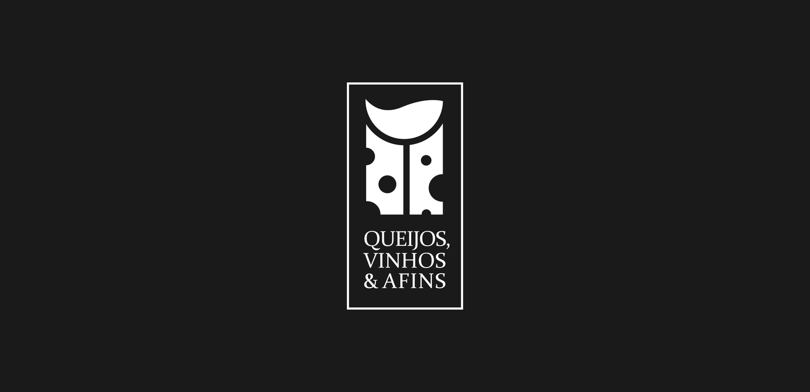
QVA’s logo
Initial Strategy
During the project briefing, the client defined the desired brand attributes as clean, sophisticated, and artisanal, targeting an upper-middle and high-end audience. The launch strategy was divided into two fronts: online and offline promotional campaigns before the opening, and the development of printed materials to support the store launch.
Branding & Visual Language
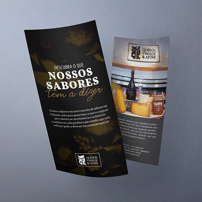
We developed a visual identity based on a restrained color palette of black, gray, and gold to reinforce the brand's premium positioning. Two complementary typefaces were selected to create visual contrast while ensuring flexibility across different applications.
From these core elements, we built a cohesive visual system that could be consistently applied across launch campaigns, operational materials, and future marketing initiatives.
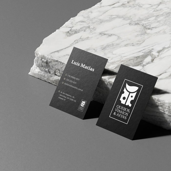
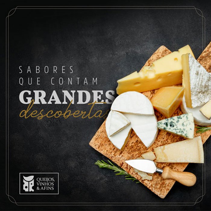
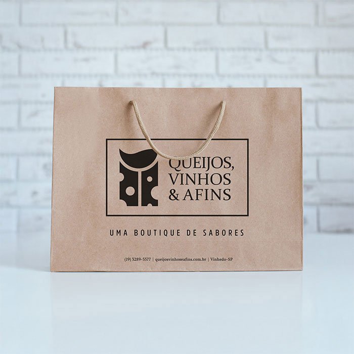
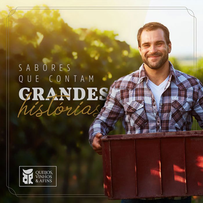
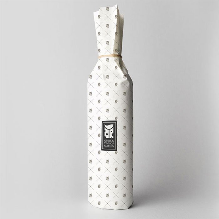
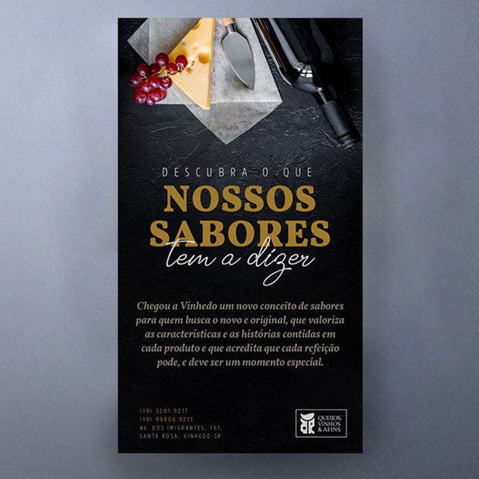
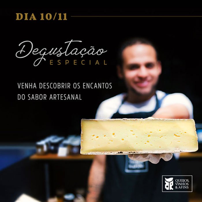
I was responsible for designing the first communication assets, including teaser posts for social media and printed promotional materials for the store opening, establishing visual standards that served as the foundation for the rest of the brand's communication.
I also contributed to the development of operational materials such as labels, packaging, shopping bags, and other branded collateral. During the photoshoot, I worked alongside the senior designer to guide the art direction, ensuring the creation of a versatile image library with compositions and framing that could easily be adapted for social media and future promotional campaigns.
Phase Two: After the Opening
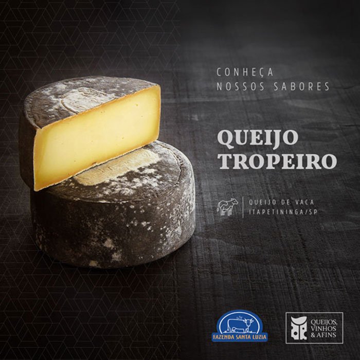
Following the opening, the focus shifted from building the brand to strengthening its relationship with the local community. The store began hosting wine tastings and small events, leading to the creation of dedicated visual identities for each initiative. This helped improve event recognition across social media while maintaining a consistent brand experience.

Key Takeaways
This project reinforced the importance of designing flexible visual systems. Although the logo had already been defined, we were able to create a cohesive visual language that supported both digital campaigns and printed materials throughout the evolution of the brand.
It also marked an important milestone in my career, as it was one of the first projects where I had the opportunity to lead design decisions with the guidance of the agency's senior designer. The experience strengthened my ability to translate strategic direction into cohesive visual solutions while taking ownership beyond the execution of individual design assets.