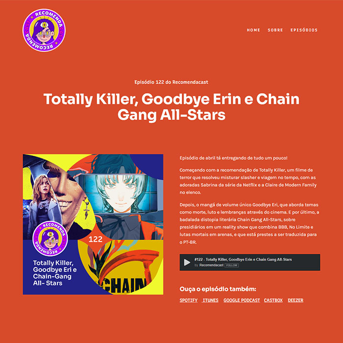
Turning variety into identity: The Rebranding of Recomendacast
Rebranding and visual system for a pop culture podcast focused on recommendations outside the mainstream. The project aimed to transform thematic variety into a recognizable, scalable, and consistent identity across digital platforms.
Branding
Visual Design
UX/UI Design
Team
Two people
Role
Designer
Responsibilities
Branding, art direction, visual strategy, design systems, social media templates, website UX, and information architecture.
Impact
Within the first three months after the rebrand:
+700
website visits
~400
episode downloads
31%
growth in plays
12%
increase in Spotify followers
After one year:
63%
increase in website traffic
44%
increase in streaming platform plays
49%
growth in downloads
Problem
Created in 2019, Recomendacast was born with a different approach: short episodes, a solo-host format, and varied pop culture recommendations within the same episode.
Despite its unique concept, the podcast struggled to translate that proposition into brand recognition. The existing visual identity failed to communicate the project’s personality and made it difficult to build a consistent presence across the website, streaming platforms, and social media.
The main challenge was creating an identity capable of representing diversity without losing recognition.
Challenges
🙈 Lack of brand recognition
🤔 Inconsistent cross-platform identity
↔️ Flexible episode formats
🐢 Slow content production
🔍 Poor content discoverability
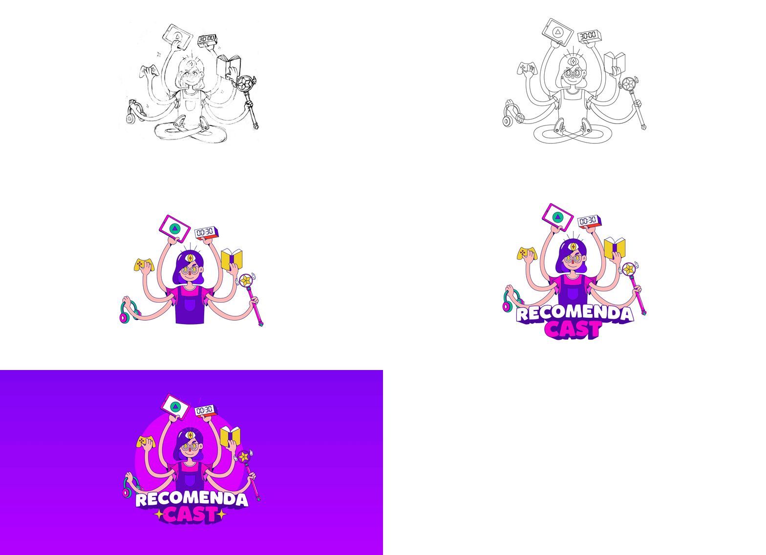
Podcast logo creation process (sketch > vectorization > coloring > typography > final result)
Strategy & Research
The research explored market and competitive analysis and references associated with multiplicity, knowledge, and strong symbolic presence. The goal was to find a visual archetype capable of representing cultural variety without compromising visual consistency.
During the moodboard creation process, developed collaboratively with a journalist involved in special episodes, the idea emerged to use a multifaceted entity as the conceptual foundation of the identity.
This direction visually translated the podcast’s core attributes:
💜 Diversity of topics
💜 Broad curation
💜 Cultural discovery
💜 Strong authorial personality
💜 A sense of repertoire and knowledge
This approach also helped differentiate the project from most independent podcasts, which often relied solely on host portraits as the central branding element.
Solutions
1. An identity built as a visual system
The new identity was built around a custom illustration designed to function both as the central brand element and as a flexible asset adaptable to different digital formats.
The character represents multiplicity and cultural curation. The multiple arms, each holding an object associated with a specific theme, visually reinforce the diversity of recommendations featured in the podcast.
Beyond strengthening the project’s authorial identity, the solution created a more memorable and flexible brand for future applications.
2. Scalability across platforms
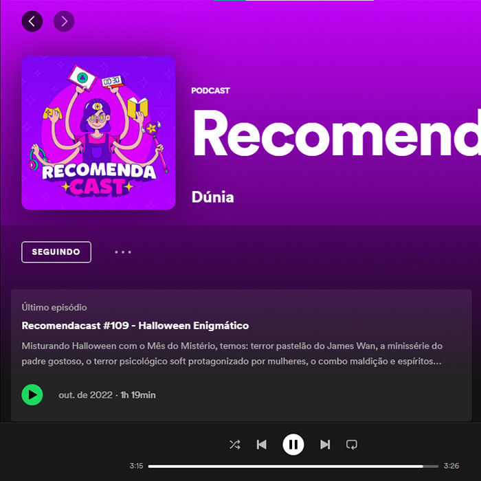
In digital environments, the brand needed to work simultaneously across:
🎧 Streaming platforms
📱 Social media
💻 Website
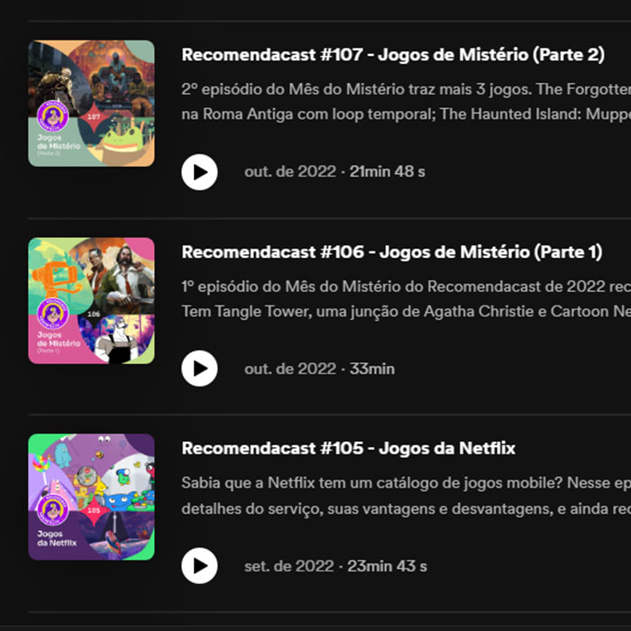
🖼 Episode thumbnails
To support this, a brand system with three main variations was developed:
1️⃣ Full version for platforms and larger formats
2️⃣ Badge version for intermediate applications
3️⃣ Avatar version for smaller formats and social media
This structure ensured visual recognition even in reduced or low-legibility contexts.
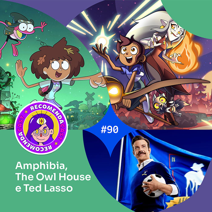
3. A content-driven visual system
One of the main challenges was the structural variety of the episodes. The number of recommendations changed constantly, making it difficult to create consistent templates.
To solve this, a retrospective analysis of published content was conducted:
51%
of episodes contained two or three recommendations
32%
were special episodes with guests and specific themes
17%
corresponded to experimental or less recurring formats
Based on these patterns, a modular layout system was created for episodes containing two, three, and four recommendations.
This approach provided:
✅ Visual consistency
✅ Faster production workflows
✅ Flexibility for new formats
✅ Immediate recognition on social media
4. Content Discovery & Website UX
Testing revealed that listeners rarely searched for episodes by specific titles. Discovery happened mainly through interests related to emotions, themes, or media types.
Initial attempts using traditional text-based search showed low performance and poor alignment with actual user behavior.
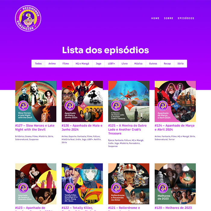
The solution was to replace the search-first logic with a filter system based on tags such as:
🎬 Content type
🤙 Feelings and “vibes”
🌟 Special episodes
↩ Recaps
This change aligned navigation more closely with listeners’ mental models and encouraged deeper catalog exploration.
Visual Work